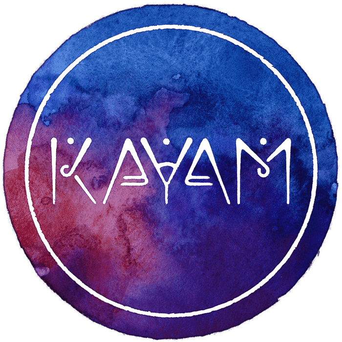
KAYAM
An Israeli-German sibling band, known for the self-invented music genre »Falafel Pop«, a both upbeat & melancholic fusion. The project was an unbelievable exploration that took me over a year to complete. Besides the overall rebranding, I created the web design, merchandise and a lot more.
Web
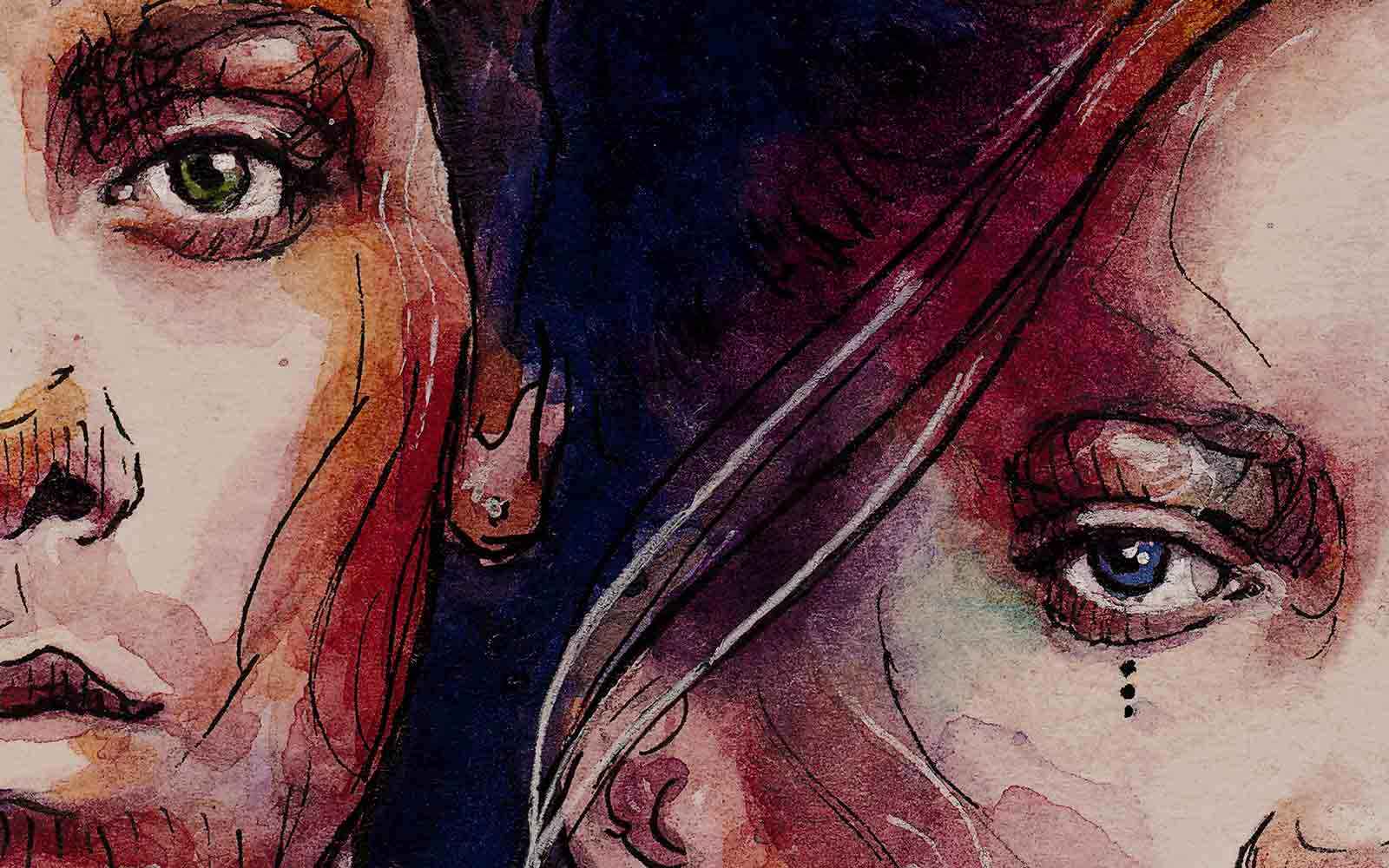
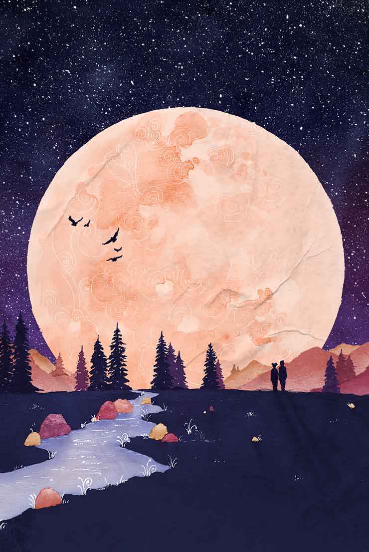
First of all i have to emphasise that the following artworks were all created by the fabulous Kim Rauss. She is one part of the KAYAM duo and besides that, an incredibly talented visual artist. My mission was to transform her watercolour paintings into an interactive experience.


An invitation
Just as KAYAM's music is vibrant, so should be the website. An immersive parallax effect serves as a magical entry into a dreamlike world full of things to discover. To create the effect, each of the 16 separate layers follow an individual motion pattern, which is controlled by the user's scroll progression.

Untangle me
The various content sections are repeatedly accompanied by vivid animated artworks. This way the user is not overloaded with cluttered information and instead has time to breathe and dive in.
Sing along
One of the site's key sections is the band's showcase of previous releases. Here, users can deepen their experience in a playful way by viewing lyrics and artist words for each individual song.
Go live
It was tremendous fun to explore the possibilities of animating even the smallest illustrations like these light bulbs. And the custom-made color palette shines through particularly well here.


Sun & Moon
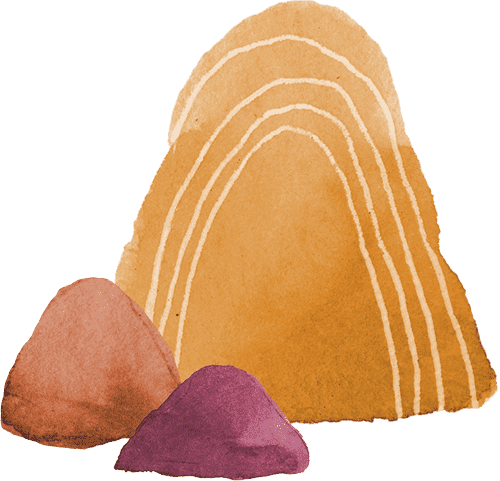
A recurring theme in KAYAM's music is the image of sun and moon, light and dark, upbeat and melancholic. Therefore, we developed the artwork of a cave, which not only links day and night on the site, but also gives a little twist to the world in which the user is immersed. Contrary to expectations, the sun rises inside the cave and if you keep scrolling, a brighter world awaits you.

Mike & Kim
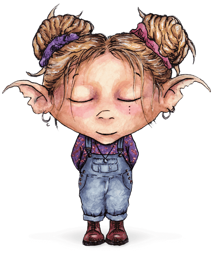
At the end of the page, you will be surprised by these magical creatures, which portray the siblings in an enchanted form. They add a final personal touch to the site and fit in incredibly well with the created world. Say Hi!
Identity
The overall rebranding of the band consisted of numerous stages. Again, I would like to mention Kim Rauss, who provided all the drawings. At every step of the way, I accompanied her in an art director's position and digitally processed her materials.
Logo
We collaboratively designed the logo and, to give it an organic touch, Kim redrew it by hand. Then created a series of watercolour circles, which I digitally merged with the logo to create a wide range of coloured variations. In addition, I animated the logo, using a vector-based process, so that it can be easily used on the web as well.

Font
The custom-designed KAYAM font-family comes in three different weights (regular, medium & bold) and was also drafted in cooperation. It is built around the letters from the logo and each glyph was again hand-drawn by Kim and digitally retouched by me. Finally, I carefully adjusted the spacing of each possible character combination, as this is crucial for a balanced typeface.

Colour palette
Like you can already see on the website, the color palette is used throughout the entire corporate design. The colours were carefully selected in cooperation with KAYAM and reflect various elements from their Israeli background like the night and the desert.

Elements
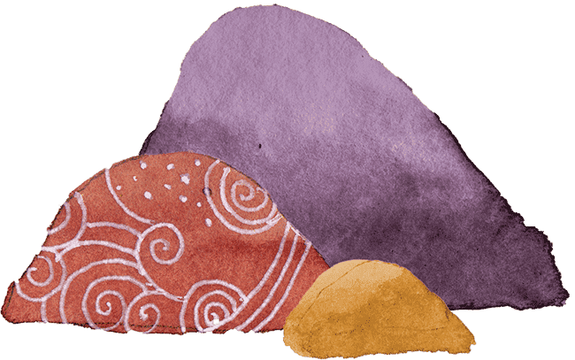
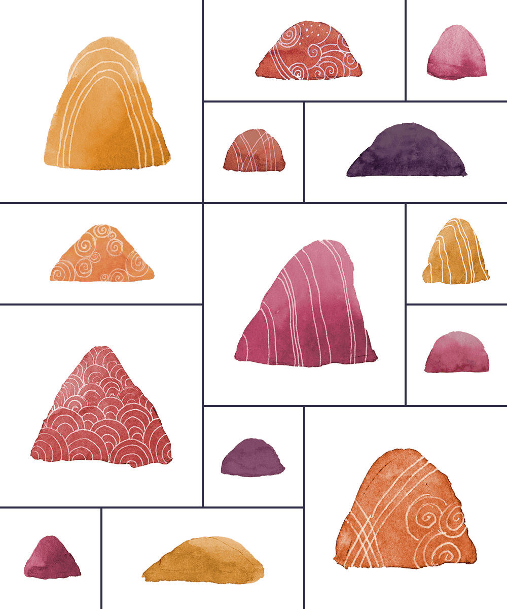
Kim drew a whopping 141 scribble- and 39 stone illustrations to use in all kinds of media, including the website. They portray elements the band personally feels close to.
Merch
As part of the rebranding process, I created several print media for KAYAM. They are based on the previously taken steps and although the print world is not my main area of expertise, I am very satisfied with the outcome.
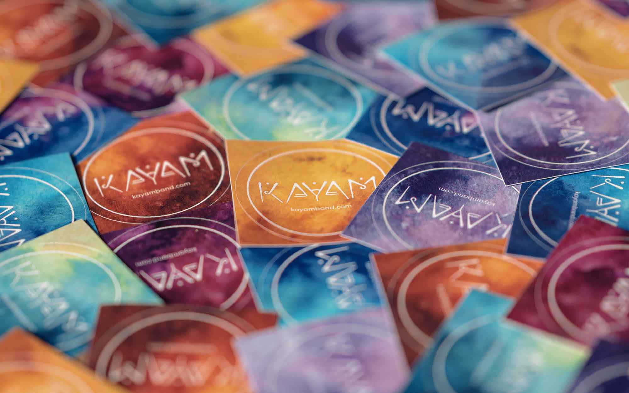
Stickers
For each coloured logo adaptation, a set of stickers was printed, which the band gives away for free at their concerts. They are a great eye-catcher and it's always fun to see how fans choose their favourite colour.
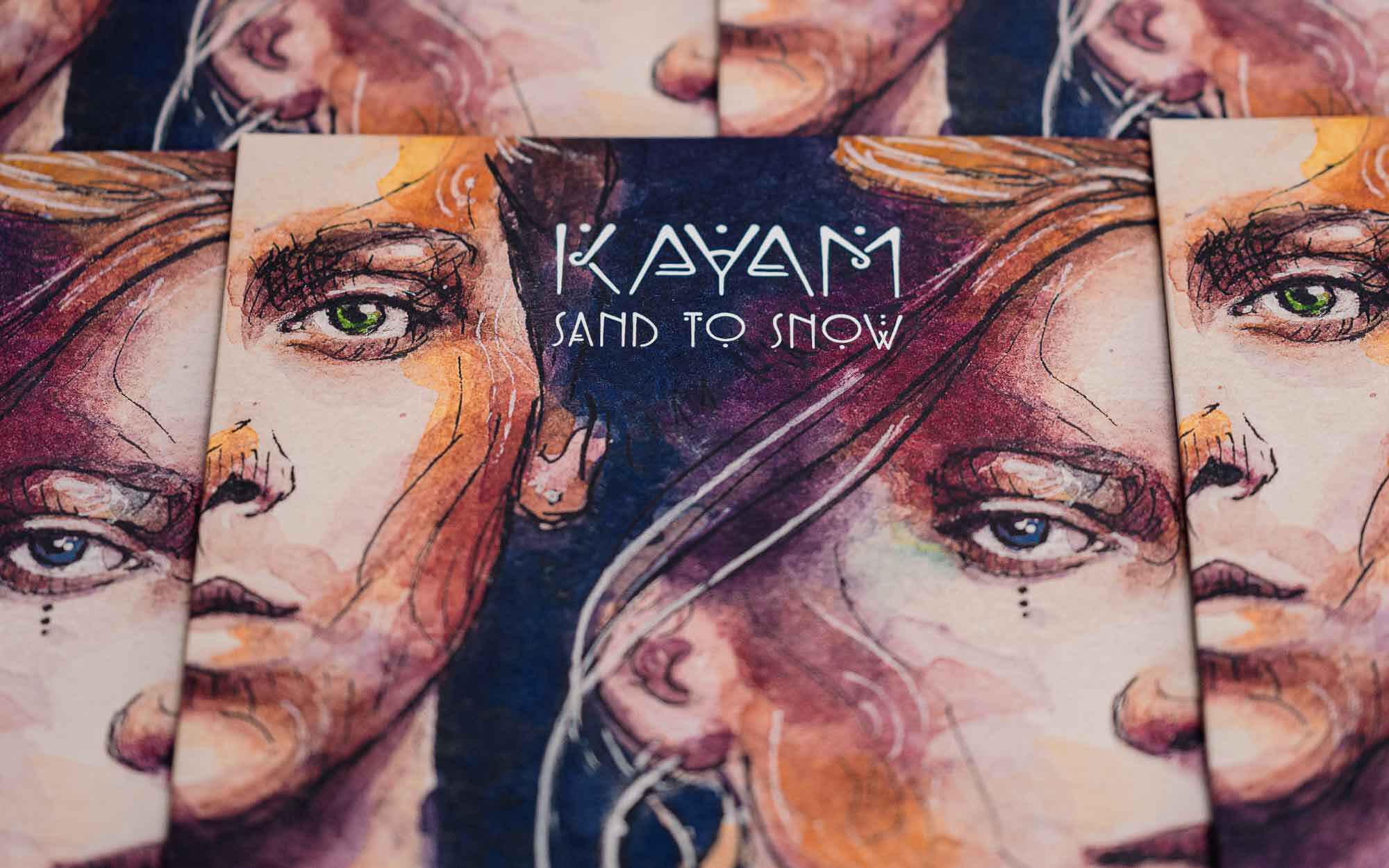
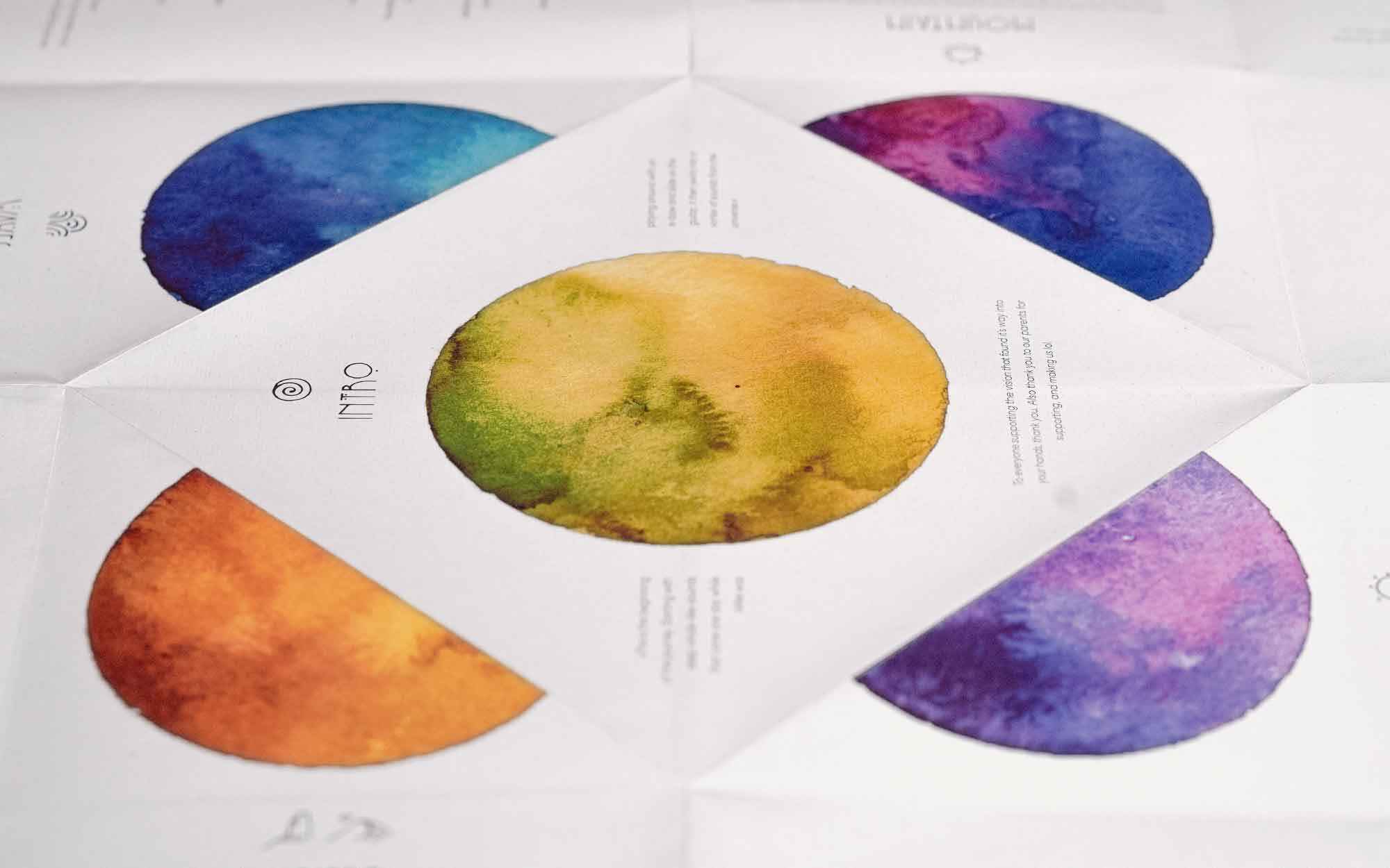
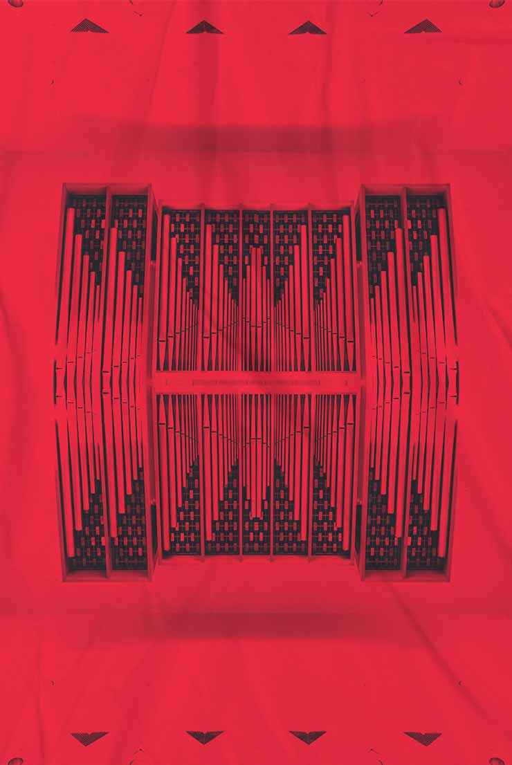
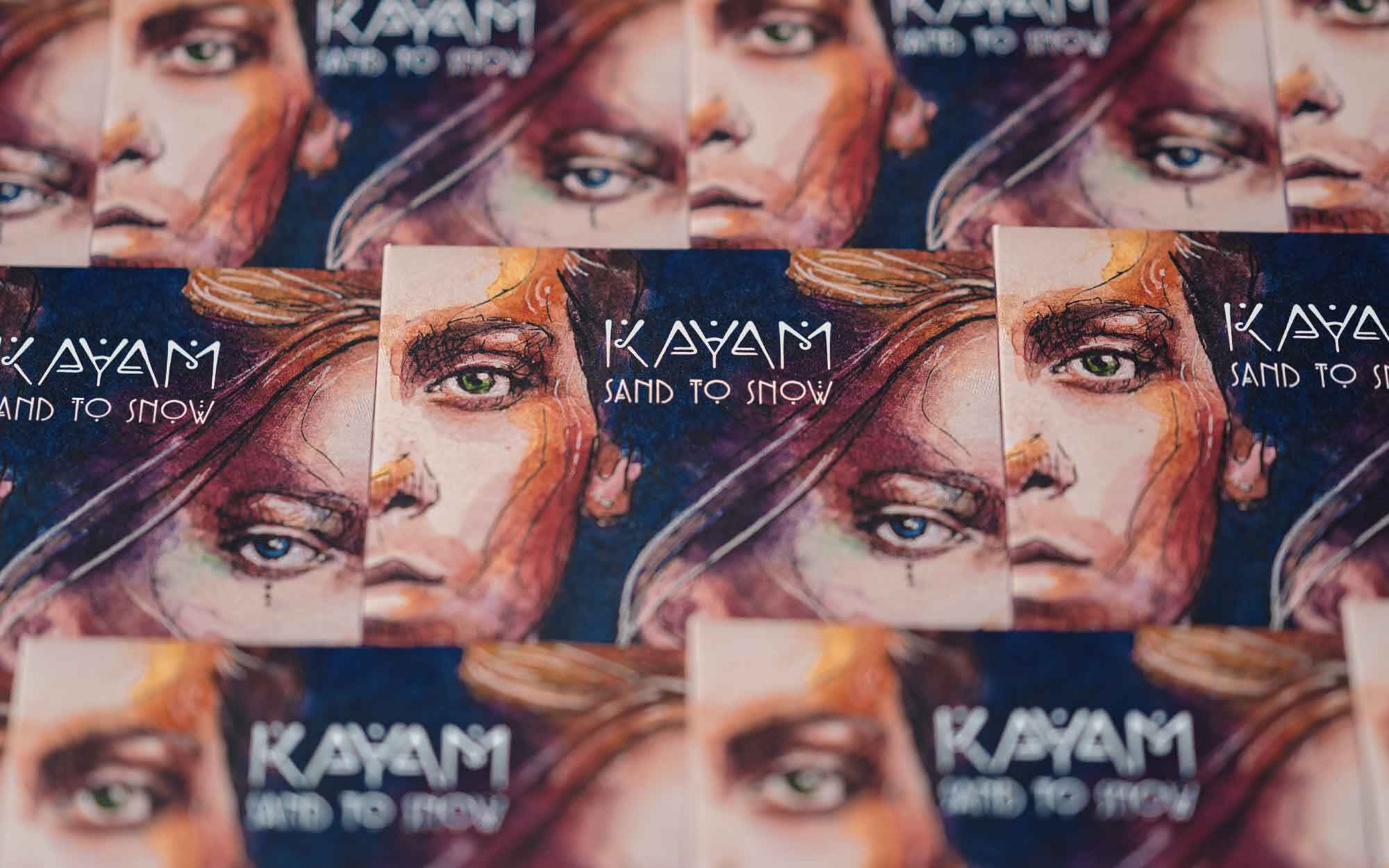
Vinyl & Poster
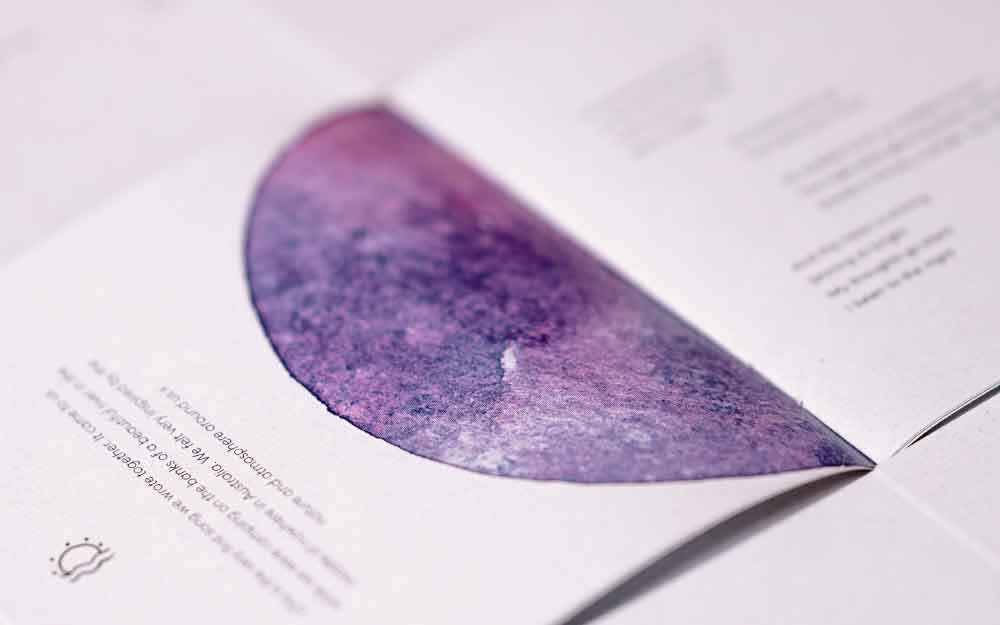
the artwork for vinyl & cd comes again from Kim and was edited by me. particularly noteworthy is the large accompanying booklet poster, which features a special folding technique dividing the surface into numerous fields. the arrangement of the elements I created is based on the folding lines.
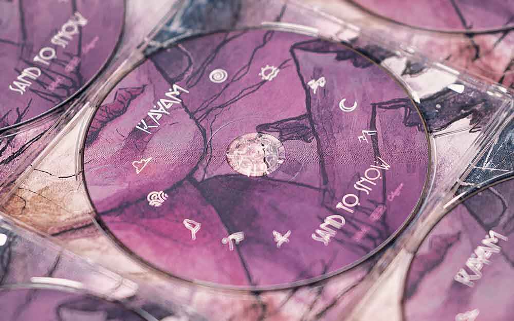
CD & Booklet
following a similar design as the vinyl, the cd is enclosed with a regular booklet. in order to reduce the ecological footprint of the band, recycled paper was used for printing, which additionally provides a special haptic.
Content
While closely accompanying the band and also visiting their second home in Israel, various content has been created, mainly through photo and video shoots.
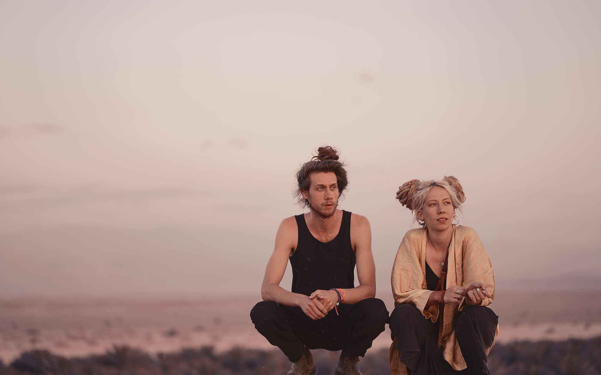
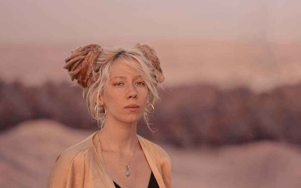

Photography
One of many beautiful shoots in Israel, here in the south of the country. In the middle of the Negev Desert, right after a festival performance of the two to catch the last sunbeams.

Video
To finish off, here is some music from the two, fresh out of their mother's beautiful garden. It's a Cover of Bon Iver and one of their most loved songs. Camera, Editing and Color Grading was done by me.